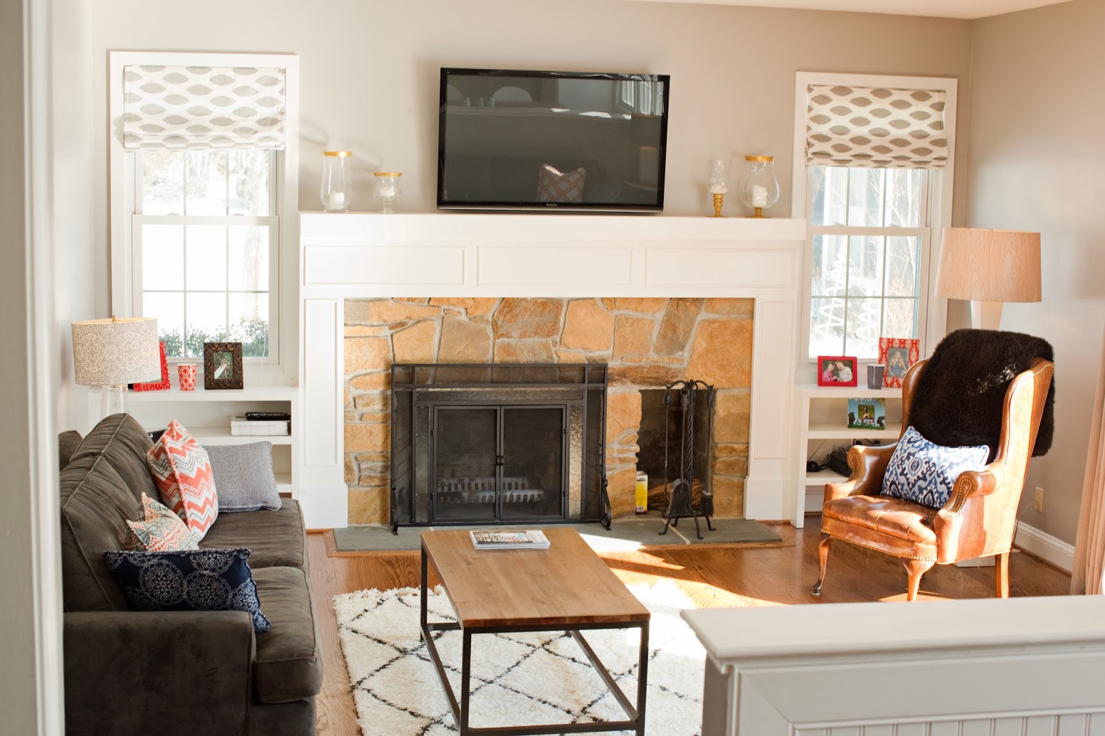
before-
my gripes: mantel had a country feel (and not in a good way); the brass fireplace screen had to go; carpet is not conducive to 3 kids and 2 dogs; and the TV did not belong in the corner.
the potential: killer view of the lake; triple glass door; open floor plan to the kitchen; and a great size
after-
Finally, let there be light! The brown walls are gone, and they were painted with a med grey 'Zepplin' ICI Deluxe paint. It gives it a fresh look contrasting with the bright white trim.
Goodbye carpets and hello new red oak 4 1/2 in plank wood floors.
The sunburst mirror brings brass back into the room, but with a modern touch. I added my favorite colors with navy, white, orange, and hot pink throw pillows. It adds a pop of color off of the grey velvet couches.
You can see the fire place detail that our friend and contractor Kevin Brown installed to hide the ugly mantel. The candle motives I made and you can find the out more about them here.
I like the organic feel of the stone against the sophistication of the white mantel. Did you notice the brass fireplace gone? The new black screen gives it a simple update.
What family room is complete with out a family portrait? It can be done in a modern way, by adding a wrapped canvas print. The navy and emerald green colors bring another touch of color into my room. Thanks to Dougherty Photo Designs for taking the picture and doing 5 head swaps (including the dog's)!
Who doesn't love pouf's? I scored these at Tuesday Mornings for $25ea.
A leather chair to read next to the fire. The fur throw and grey velvet drapes bring texture and warmth to the room.
New DIY roman shades for under $10. These keep the windows bright and fresh. You can see the step by step tutorial here.
* Photo Credits by Dougherty Photo Designs


No comments:
Post a Comment